
We often hear about the worst, most garish kits ever to disgrace a football pitch; the polyester monstrosities committed in a crime of fashion that were so bad you actually felt sorry for the multi-millionaire rapists forced to wear them.
Yes we’re talking about Coventry’s chocolate brown effort from the 1970s that was strangely reminiscent of a backstreet abortion; Everton’s salmon leap of insanity from the mid-90s; and Norwich’s canary massacre from that same era. All have been widely mocked and shamed.
But what about the shirts that received neither praise nor mockery? The under-rated gems that barely blipped upon our radar at the time because our eyes were stinging from the opposition’s decision to wear tiger-print.
Here are five such beauties……
Wales late-1970s – The Croatia chessboard shows how not to utilize a country’s colours. Here Wales illustrate how it can be done tastefully and with real panache. Yellow and green stripes waterfall down each side and the badge is proudly emblazoned dead centre. Admiral either do kits well or atrociously. This falls into the former category.

From an era when Welsh players had names such as Dai and Leighton instead of Craig and Wayne.
Dundee United early-1980s – Like the classic Dutch kit’s younger brother (it even has a similar, but smaller, emblem) only with having the advantage of being tangerine rather than straightforward orange. This is a Scottish masterpiece. Simple, imposing and stylish – the three criterions of a great football top.

Everton 1966 – White crewneck, the rest a sea of royal blue. EFC in slanted italics. Class should be effortless. This is.

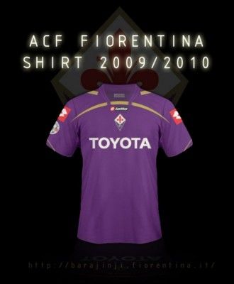 Fiorentina 1996 – Italy; the place where footballers never retire and shirts are given the same chic importance as an Armani collection. This is partly due to the peninsula appreciating the fineries of culture more than most. But also, lets be honest, a football top is not designed for the eleven players on the pitch but to appeal to the thousands of supporters they hope to royally rip off. And in England the shirt manufacturer’s demographic is largely made up of heart-troubling salad-swervers whose main requirements are that it’s available in size XXL and resistant to pie spillage.
In Italy they’re knocking tops out for slim, tanned, scooter-boys who say ‘ciao’ a lot. Hence their efforts are usually slim-line, sexy and aesthetically pleasing.
To be honest we were spoilt for choice here.
But, keeping with our under-rated theme rather than say plump for the classic Inter 60s design, we were left with two from differing eras. The 1980s Palma yellow and blue. Or this modern-day viola dream. Unusually featuring both shirt-maker and badge dead centre and with an understated gold trim. The only way to improve this nifty number would be if club legend Gabriel Batistuta was still around today modelling it, celebrating yet another goal, arms outstretched like a rogue Christ.
 Sweden away 2010 – For decades the Swedish kit were designed by Adidas who always somehow managed to complicate the pleasing hues of yellow and blue into various stripe-infested eyesores. Some, such as their early nineties number, bordered on the gaudy. Thankfully Umbro took over the reigns and pared it all down to classic simplicity. This has reached a zenith with their latest offering and looks particularly striking with the blue away shirt. Cleverly just using the badge, Umbro symbol and hemlines to bring through the yellow. The rest looks plain to a plain man but stylish to the stylish.
And finally one that gives us hope for the others…….
 QPR 1980s – Once an under-rated jewel this has now become a cult classic. Sadly this is mostly due to it being worn frequently by the Keith Chegwin of Byronesque wastrels Pete Doherty. But needs must and this deserves its elevation in popularity.
Rarely does a sponsor actually enhance the stylings of a shirt but in this case the emboldened typography of Guinness adds a strong identity to the look. The splashes of red are subtle yet distinct and the overall result gives the impression of a designer who knew exactly what he was setting out to achieve (rather than be the best of several options).
This timeless beauty was too cool to get muddy – which was probably the real reason for the plastic pitch – and far, far too good for the likes of Glenn Roeder.
